The "Warrior" Logo

The "WARRIOR" - 1950's to mid 1960's

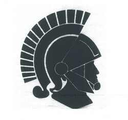
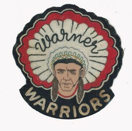
Originally, a warrior was a native warrior as seen in this photo to the left.  Not much is presently known about this logo, but it is known that it was used at some point.  As more information becomes available, we will add it to this portion of the website.

This logo was abandoned likely because of the potential for controversy that logos such as this were experiencing at the time.

The "W" - mid 1960's to late 1992

After abandoning the above logo, the Warriors decided to adopt a simpler concept.  The "W" was adorned by all sports teams for nearly two decades.  Simple in design, this logo was a classic standard for Warner School.

The "New Warrior" - Mid 1970's?

Little is known about this Warrior logo.  The logo itself was never used on sports teams as the official logo, but its use was seen throughout the school.  This logo does represent the first time that a "warrior" had transformed itself from the native warrior into the "Roman Warrior" which has persisted in concept to this day.

The "Classic Warrior" - 1992 - 2002

In 1992, a contest was held to design a new logo for the school as the traditional "W" was no longer sufficient for the school.  Local student and artist Jacie Andrews won that competition with this original piece of artwork, seen here to the right.  This locally produced logo would become standard for all athletic clothing for the next 10 years. 

The "Modern Warrior" - 2002 to 2017

As one can see, the "Modern Warrior" is simply an update of the "Classic Warrior" with the addition of a hockey stick.  The hockey school was still in concept stage when this Warrior logo was designed, but the intent was to modernize the existing logo and to show that we were entering a new era that involved the addition of the specialized Warner Hockey School.  Luckily, the initials still worked for both the 'Warner High School' as well as the 'Warner Hockey School'.  This was not by coincidence as the final choice of name was influenced by the ability to use the same letters.

The "WARRIORS" - 2017 to Present

We are all warriors in our unique way. As part of our Modernization process we used student art work as an impression for the newest logo to represent our school. We felt it important to celebrate our agricultural community roots by incorporating the wheat into our logo. We maintained the traditional black and red while adding grey into the colour scheme. We are a K-12 school and proud to serve the needs of our students!